
Breaking down my research from numerous different illustrators and their designs into a more select variety, I have decided to focus in on the illustrators; Mick Inkpen, E.H. Shepard, Alison Edgson and Susanna Gretz.
Mick Inkpen
 |
| 1. The Kipper Collection (Kipper and Roly) 2. Threadbear 3. Bear 4. Wibbly Pig |
Links:
Mick Inkpen Talks About his works (A great interview with Mick Inkpen)
E.H. Shepard
 |
| 1. & 2. Winnie the Pooh 3. & 4. Wind in the Willows |
E.H. Shepard's designs work with watercolours and pens to create the human-like creatures of classic children's stories such as Winnie the Pooh and Wind in the Willows. E.H. Shepard, unlike modern illustrators such as Mick Inkpen (who illustrates more contemporary designs), created more vintage-style designs, which fit in precisely with the era in which he was at work. These illustrations (along with the hand-rendered typeface) work in perfect harmony with the classic stories.
The E.H Shepard Archive
(below are scans from my book)
Cover:

Stories within the book/back cover:

Double-Page Spreads:


Singular Individual Pages:


The friends celebrate Frog's birthday - Further use of speech bubbles and busy/colourful illustration makes the reader feel a part of the excitement. Attention to detail also brings this illustration out above others in the book further

Final Pages:

The friends make light of calling each other names and know understand it's wrong to call names - Final image shows closeness between characters, symbolising that they're all friends once again

Duck stops being so bossy - Short, simple finishing sentence, further use of speech bubbles and clear, distinguished imagery.
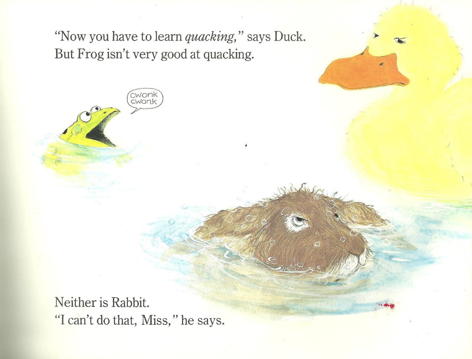
Here Come Frog, Duck and Rabbit is one of my favourite childhood books, so I've decided to scan in some stand-out pages that I remember specifically or those which elevate themselves artistically from an illustrator's point of view. Susanna Gretz is one of the first illustrators to use detailed characters and forefront illustrations above a clean white background. Illustrators such as Mick Inkpen have certainly taken over this recognisable style and carried it throughout a variety of children's books. These illustrations work in perfect harmony with the story lines of the four short stories within the book and are closer detailed and coloured enough to be captivating, but simplistic and sparse enough not to draw attention away from the story itself.
Alison Edgson
 |
| 1. Me and My Dad 2. Me and My Mum 3. When Will It Snow? 4. On a Starry Night |
Although I remember coming across a book when I was younger that I believe to have been illustrated by Alison Edgson, I haven't been familar with her work. However on further research, I've become exceedingly fond of her illustration style,
I've chosen Alison Edgson as my focused Illustrator (alongside Susanna Gretz), as I love her cute, individual illustrations, and because I feel her graduating use of colour for backgrounds placed behind characters is charming, and her characterisation brings a lightness and warmth the story. Her art style appears to center around a combination of the use of hand-rendered paintings and computer software, which gives the finished piece a softer look, rather than a rougher approach (for example use of pen).
I've chosen Alison Edgson as my focused Illustrator (alongside Susanna Gretz), as I love her cute, individual illustrations, and because I feel her graduating use of colour for backgrounds placed behind characters is charming, and her characterisation brings a lightness and warmth the story. Her art style appears to center around a combination of the use of hand-rendered paintings and computer software, which gives the finished piece a softer look, rather than a rougher approach (for example use of pen).
Alison Edgson's Published work to date:
(among stand-alone illustrations)
• Mathemagic (2007)
• Me and my Dad! (January 2007)
• Three Billy Goats Gruff (June 2007)
•The Emperor's New Clothes (October 2007)
• The Elves and the Shoemaker (October 2007)
• Silly Goose (May 2008)
• Lost in the Snow (August 2008)
• My Little Night Light (August 2008)
• Follow that Bear if you Dare (August 2008)
• Me and my Mum (January 2009)
• By Lantern Light (August 2009)
• The Magical Snowman (October 2009)
• Winter Magic: A Spellbinding Collection of Christmas Animal Tales (October 2009)
• A Winter's Night (October 2010)
• Yuck! That's not a Monster! (November 2010)
• The Magician's Apprentice (March 2011)
• The Little Bunny and Other Animal Tales (March 2011)
• A Little Fairy Magic (June 2011)
• Star Friends (July 2011)
• When Will It Snow? (October 2011)
• Winter Wishes (Animal Anthologies) (October 2011)
• Just One More! (February 2012)
• Bear and Turtle and the Great Lake Race (February 2012)
• Love You Baby: A Beautiful Baby Record Book (July 2012)
• Puppy's First Christmas (September 2012)
• Au Lit, Petit Ours! (September 2012)
• On a Starry Night (October 2012)
• I Want my Mummy! (January 2013)
• Make a Wish! (Due release 2013)
I believe all of the books Alison Edgson has chosen to illustrate for are aimed for the age range between 1-10 years old. These books are perfect 'bed time stories' for young children, as there are no intrusive, strong colours, and the illustrations are subtle. The stories themselves are slow (which makes them suitable for 'bedtime' and also for young readers) and the typefaces are clear and unique in the way that they have a warm, hand-written feel to the titles and important, highlighted parts of the story. I feel that all elements of the book (story, typeface and pictorials) are working in harmony with each other, making the illustrations successful, as (alike 'Here Come Frog, Duck and Rabbit') the illustrations and typeface don't take away from the story, more they work together to bring the story to life.
Links:
To summarise, I have found that research into many different illustrators that stand out to me to be has been of great use. I now feel I have further knowledge in relation to both image and text working in harmony with the storyline of an illustrated book, what it is that makes a successful illustration in children's book design.
No comments:
Post a Comment