50 Things To Do Before You're 11 3/4 • Task


'50 Things To Do Before you're 11 3/4' is a list of fun outdoor activities created by The National Trust to enthuse and encourage children to explore the world around them rather than to stay indoors every day. 


The list includes plenty of enjoyable activities for children to enjoy that are fading out as new technology is being introduced such as laptops, tablets and computer games. The list includes activities such as:

• Build a den

• Take a look inside a tree

• Bury someone in the sand

• Feel like you're flying in the wind

• Track wild animals

• Catch a crab

• Eat an apple straight from a tree

• Get behind a waterfall

• Play conkers

• Feed a bird from your hand


and these are just a few!

The task at hand was to create a double-page spread for a children's book aimed at children around the age of 5-7 years old introducing them to just one of the fifty outdoor activities listed (this could be either a storybook or a reference/information book). This was to be set out in full colour and to specific sizes.

Considerations:
Based on similar titles for the same age group, consideration needs to be given to the
following:

• Quantity and size of the type and the typeface used.
• Visual balance between the image and text.
• Appropriate illustration style.
• Flow and continuity of the design from one double page spread to the next.
• Integration of type.

It may also be worth considering the idea that a child’s perspective on what’s interesting
about a subject isn't necessarily the same as that of an adult.


Having studied through my research of various examples of children's books, I wanted to ensure my type was clear and easy to read, and that my illustrations were simple but colourful and captivating.

After attempting to illustrate various different activities such as 'Eat an apple straight from a tree', 'Get behind a water fall' and 'Bury someone in the sand' (shown below) I wasn't satisfied with how my characters were turning out

'Get behind a waterfall' / 'Build a den'

'Get behind a waterfall'

'Get behind a waterfall' / 'Track wild animals'
'Bury someone in the sand'

'Set up a snail race'

After numerous sketches, elements of my final design began to take place. I originally wanted to include illustrations of children in my final design, as I felt children would be able to relate to it and imagine themselves having fun, just as the illustrated children are. After trying my illustrations with various activities, I couldn't feel satisfied with the children I was sketching, and thus, decided to change my direction.

Not all activities had to involve children, but that certainly didn't make them any less exciting. So I began sketching out owls, woodland creatures, and in particular snails for the 'Set up a snail race' activity. I experimented with various colouring techniques and settled on a water-colour pencil style. I was particularly drawn to the way I could make them bolder around the outlines of an illustration and paler towards the centre, giving the illustrations a little more depth and a softer look to match the great outdoors, rather than harsh bold primary colours. 

My typeface decision was simple: keep it legible and Sans Serif. Studies have shown that Sans Serif is easier to read, especially in young children (Examples are Sassoon Primary and Flora) but I also wanted something with a warmth to it, an almost hand-rendered approach, and so settled with the typeface 'Mossy'.

My final design:


I'm definitely satisfied with my final layout, as I feel it complied with the original considerations.

I careful selected my type and the size/placement of it across the double-page spread, the visual balance between image and text I feel is equal, I have characterised the snails to ensure it appeals to a younger audience and used brighter colours than the natural colours of snails to excite the children, and I feel both image and  type work together to create a suitable and fun double-page spread for a children's book based around the 50 things to do before you're 11 3/4.

The Role of Type in Children's Books


Typography plays a considerably important role in the production of a children's book. At such a young age, children are constantly learning and picking up on new concepts. When presented with a book, it isn't necessarily all about the illustrations, especially if  that child is aged around 5+ when they are learning how to read.
It's important that when deciding on a typeface for a children's book, that it should be legible, and the text should compliment rather than compete with the illustrations. The dynamics of the text placement is also important, and could even become a part of the illustration, alike, for example the unusual 'The Mouse's Tale' by Lewis Carroll:


The Mouse's Tail - Lewis Carroll
This pure combination of both illustration and text was totally unique at the time of publishing, having moved on from the children's books of the 1800's (example shown below) this style offered a new and exciting exploration of the typical children's tale - a journey along the page.


ABC - 1850
Children's books are a product of a new outlook on the importance of children's learning. Here shows a detailed, perhaps adult, example of an alphabet book. In a mix of different colours, small text and Serif type, children of the 21st Century may find this particular example difficult to understand.

The Scarecrow - Theo Van Doesburg and Kurt Schwitters
Here is an example of a real combination of text and illustration. Here, letters become a part of the characters - leaving expressions of these characters to the imagination of the children. Colour is also minimal, which leads to believe this book may be directed at children of an older age group - perhaps around the age of 9 or 10 years old.

There Was an Old Lady - Simms Taback
This book displays a menagerie of different colours with an unique fashion. The typeface gives a hand-rendered appeal, using a selection of different  sizes, colours and styles to create one working piece. This works in perfect harmony with the paired illustration, and even with the story being told - a selection of weird and wonderful events.

The Serif Fairy - Rene Siegfried and Joel Mann
In likeness to 'The Scarecrow (Theo Van Doesburg and Kurt Schwitters), this story uses typeface to create the world of The Serif Fairy, and of course, herself. Each tree, fish, car and house are all compiled of a range of different typefaces, be they Serif of Sans Serif. This is a book, again, perhaps aimed at a slightly older audience (the age of around 9+) although this is the perfect book to practice a younger child with reading a range of various typefaces.

The Stinky Cheese Man - Jon Scieszka
This example of typography in children's books shows the text actually convulsing and distorting to due to the 'smell' of the Stinky Cheese Man. This approach adds a depth and almost realism to the story and helps elevate it, purely using the text to highlight and aid the story. This book looks like it's aimed at children around 7 years old, but again, is ideal for aiding children to learn to read text that may not be in a clear and straight-forward like across the page.

An Edward Lear Alphabet - Vladimir Radunsky
'An Edward Lear Alphabet' shows an expressionate and unique choice and style of typography, the type isn't the typical black Sans Serif typeface found in most children's books, rather, it's rough and sketchy - almost clumsy - somewhat like a child's handwriting, making it all the more relatable to a child.

Bottoms Up - Jeanne Willis and Adam Stower
'Bottoms Up' shows how text can be used as a part of the image itself, highlighting and establishing the size of the image. In the example above, this think, contrasting white typeface accentuates the size of the bear, a brilliant way to involve both image and text - but not take away from either. Both the illustration and type compliment each other perfectly.


• Becomes a teacher of young children - understanding a child's mind

• Putting himself in the mind of a child - what do they love and thrive off?

• Basing the characters around children


> Considerations

• How old are the audience?

• How much text should be shown on a page?

• Is it a read alone book?

• Is it a book to be read with adults?

• What type of book is it? Storybook/Reference information?

• What is the mood and tone of the book?

Lynne Chapman • Notes


• New story > tiny quick thumbnail sketches for each page (rough decisions)

• "Bears on the Stairs"

• Illustrated endpapers (before and after the story starts/ends) leading in and out of the story, setting the scene/telling a part of the story and setting it up (For example, the maps of Hundred Acre Wood in the Winnie the Pooh books)

• Illustration all about giving the bears personality - interaction between illustration and text in rough notes, giving them a small backstory

• Her rough drawings are close to her final illustrations - the more detail early the better ("covering her back")

• Vibrant pigment pastels are used on textured pastel paper (pastel pencils and chunky pastels)

• "Always work big with pastels"

• Researches photographs of specific animals or people off the internet > what makes this animal/person what they are?  Proportions, characteristics and personality (type of nose, sort of hair/hairstyles, how far apart the eyes are, how big their heads are etc)

• "Stinky!"

• Thumbnails > work through pages and double-page spreads > asks publisher to print out how big the final pages will be > "scrappy" drawings > neater, more detailed drawings > Drawn finally on to pastel paper with pastels (the original)

• Her designs involve intricate details


I absolutely love Lynne Chapman's work with children's books, her attention to detail is stunning, and her use of vibrant, attractive colours really bring a story to life.
What appeals to me most of all about her illustrations are the amount of thought gone into each individual character (even if they're not primary characters of the story, for example, the "scary bears" in "Bears on the Stairs"). I've taken on board how to create characters (such as animals and people) by researching into their appearance before I begin working, and I'll definitely remember this when illustrating my own work.

Ed Emberley • Notes


• Illustrated over 100 books

• His designs are inconsistent with each other - his style varies

• Speaks through his books - designed for "the other me's in the world" who understand him. His book speaks to them if they are "like" him

• Lives his personal home life like a scrapbook

• Thumbprint books (teaching children an easy way to illustrate)

• Use of collage

• Began with use of pen and water colour (no computer or felt tip)

• use of very thin pen

• Began freelance in children's magazines

• "The Wing on a Flea"

• Move to "woodcut book" - printing on to paper from chiseled wood with ink (pine wood and rice paper)

• He's a "totally different artist"

• "They Story of Paul Bunyan"

• "London Bridge is Falling Down"

• "Simon's Song"

• "Rosebud"

• Colour and overlay sometimes separated

• Involved with interactive media now, such as tablets etc - "Go Away Big Green Monster" (example below) 


I admire Ed Emberley's range of different medias, using a selection of tools and techniques to make each individual book or working of his stand out and stand alone. It's almost impossible to pin Ed Emberley down into one specific style as all are completely unique. I'm particularly drawn to the point that not only is he using a variety of different art medias to display his work, but he's also experimenting with interactive apps for Ebooks, as children are now being introduced to this new level of technology at a much younger age than previously, and are learning in not only by traditional ways, but also by new and contemporary media.

BBC Picture Book Video • Notes


• Look for specific ways illustrators engage children

• Encouraging relationships

• Adults = text oriented / Children = picking up on parts of illustrations not always noticed by adults (See example books: ''Peepo!' and 'Each Peach Pear Plum' by Janet and Allan Ahlberg)

• Entering the "world of play" with books

• Building up of suspense across pages

Rhyme, rhythm and repetition combination

 Pacing and rhythm - not just what the words mean, but more importantly how the words sound (bouncy, rhythmic)

• A bonding experience between adults and children

• Caldecott 1877-1886 - first children's book illustrator

• Beatrix Potter - first author and illustrator of the same book

• "Little books for little hands to hold" - Beatrix Potter books

• 'The Tale of Peter Rabbit' - 1902

• Animals in Beatrix Potter's tales are "small and in danger" (relatable, like a child)

• Anthropomorphism - the characterisation and personification of characters like Peter Rabbit, who wears a little coat

A unique world with memorable characters

• 'Thomas the Tank Engine' - 1942

• 'Thomas the Tank Engine' is a parable for naughty children (going off the rails)

• Key to success with 'Thomas the Tank Engine'? "The faces. Faces have an extraordinary power to move you."

• Enid Blyton - 1949

• 'Noddy' exploded with colour into a world of black and white (Harmsen Van De Beek)

• 'Noddy' is relevant to the time - postwar.

• 'Noddy' known as "puppet books" including teddy bears and dolls - alike the contemporary 'Toy Story' animated movies

• 'Noddy' - crime, punishment and authority

• ABC books, flat colour on one side, image on the other. Exuberant (leaning a little more towards a picture book than a children's book?)

• "Not just 'A' for 'Apple' or 'F' for 'Fish'"

Messy illustrations relate to a child's own pictures

"The essential thing is creativity"

• ABC new ways of unlocking children's potential

• Childhood is important now - looking at it in a new light

• 'Rosie's Walk' by Pat Hutchins - each double page spread is a little journey/story (like a silent film) Silent Fox is after Rosie, and turning the page affects the fox. This gives the power of superiority to the children - they can see what is happening

• Young children - yet to read - can understand complex images. They make very big jumps.

• 'Dogger' 19070's (Renaissance in children's book illustrations) by Shirley Hughes - something close to their own lives. The story of losing something close to them, in this case a cuddly toy - traumatic! Tensions. Hughes puts herself "inside the emotion of a child"

• Expressing emotion in the stance and facial expressions - realism in illustration. "A wealth of detail to delight in."

"Traveling around the page with you eye."

• 'Granpa' by John Burningham - fragments of poetic conversation. Allows conversation about personal opinions, thoughts and feelings between the reader and child

• 'Granpa' - Evocative picture and unusual text

• 'Granpa' - Raising deep issues

• 'Granpa' - leaving space for the reader to fill in the gaps. Doesn't need to be spelled out - Granpa is gone

• 1980's - before this time, if babies couldn't speak, they were thought on as incomprehensible

• Children are introduced into a world of "buzzing confusion" and reading a book slows it down

• 'Friends' by Helen Oxenbury- using simple images and characters that babies would recognise

• Janet and Allan Ahlberg (Janet - illustrator, Allan - author although both working together as a collaboration) 'Each Peach Pear Plum' - a game of 'I Spy' ("Each, Peach, Pear, Plum, I spy Tom Thumb!") Also a game of join-the-dots, characters hiding in the illustration from a previous page

• Interactive point-it-out books - a bonding experience

• Reading as play "We're Going on a Bear Hunt" - repetitive stories

• 'We're Going on a Bear Hunt' illustrated by Helen Oxenbury - use of words that aren't real, but are fun to say such as: "swishy swashy, swishy swashy..."

• Realism and believability to the story

• Typical family approach

• Recapping everything while being chased back home by a bear

• 'So Much' by Trish Cooke (End of 20th Century)

The family element - capturing the spirit of family

• Story-telling from Dominica - the art of oral story-telling translated into books

•  Includes the reader so they feel like a part of the story themselves

Read-aloud text, fun to read to a child

Ending on a calming note, ready for bed (not only for the character, but also for the child listening/reading)

Today's children's books are experimenting with different media approaches, for examples Lauren Child's 'Charlie and Lola'

• 'Charlie and Lola' - collage work, "Lauren begged, borrowed and stole from the real world for her illustrations" somewhat like a child does.


Genres • 9-11 Year Olds


The features and styles present in a children's book aimed for the age range of 9-11 year olds

Once a child reaches the age of around 9-11 years, they are already familiar with a wide variety of children's books, and have read about an array of different adventures, learnt their alphabet, colours and numbers - and in doing so, they've become a tougher audience to please.

Once a child begins to approach their final years of primary schooling, they are normally by this age looking towards reading longer books, with more text in than what they were comfortable with around the age of 5 years old. This means it's imperative the story itself is compelling enough to keep a child with such an active imagination satisfied without the aid of illustration. Although, illustration is not entirely out of bounds for children of this age group, with children's book collections such as Roald Dahl books and Dr. Seuss' books, the incorporation of image and text brings a character and light to the stories - which, as stories themselves, work perfectly as stand-alone books with no added illustration.

It's not just fiction books that keep children of this age group enthralled. For children exploring a whole new world of education and puzzles, sometimes the stories that a real can seem the most interesting. It's no longer just about monsters, fairies and far away lands, these books are about how your body really works, and how animals stay alive out in the wild, and how vehicles such as aeroplanes and cars work. This information may be a little too much for younger children to grasp a hold of, however children between the ages of 9-11 find themselves not only being introduced to this information in schools and conversation, but they can see it come to life in illustrated books such as 'How My Body Works' illustrated by Frances Cony. In these books, every single element of the human body comes to life in a way easy for children to understand - cells have little bodies, faces and personalities of their own and work together not only to avoid any problems that arise, but to also keep their body moving and working. This makes the science not only informative and fun, but also relatable. 


To summarise, whether or not a children's book aimed for 9-11 year olds is fiction or non-fiction - there's definitely an art to getting the stories and information inside to captivate their young, impressionable and imaginative minds. Unlike books aimed at younger children, these books are more text-heavy rather than reliant on images, however, just like any any children's book, images play an important role in helping literate and accompany the text, for characterisation, personification and confirmation comprehension purposes.

Genres • 3-6 Year Olds


The features and styles present in a children's book aimed for the age range of 3-6 year olds

Children's books aimed at the age range 3-6 years old, are possibly the most difficult of their kind to design. This is in comparison to books designed for babies, where they can be solely reliant on their pictorials, sensory elements, colours and big words, or to book aimed at 9-11 year olds where they become more dependent on the written element, as the child is growing and learning to read. 

But for children right between those ages, designing books that compel them can be a challenge. Children all develop at completely different ages, by 6 years old, a child can either be more interested in imagery and colours - learning how to read at a slower pace, or alternatively, they can be looking towards more 'heavy duty' books with little no pictures - such as J.K. Rowling's 'Harry Potter'. It's important find a medium between these two very different age groups - a book that appeals to both groups of children who are still in the process of learning to read, and those who have picked up reading quicker and are looking for stimulation not only in pictures, but also in text.

Great examples of styles that suit this age group are found in book collections such as 'Beatrix Potter Books' (Illustrated also by Beatrix Potter) and 'The Magic Key' illustrated by Alex Brychta.


These books fit the purpose entirely. A balance between text and illustration enough to keep any child of this age group compelled, at whichever speed they are learning at. Beatrix Potter's collection of  books, although appear to be dated in comparison to contemporary children's books, to this day still work wonders with children between the ages of 6-9 years old. The images show personification and character in these tiny woodland animals in big - somewhat frightening or confusing world - understandably, this is relatable to young children. The adventures and relationships of the characters in Potter's story are apparent via not only the illustrations, but also in the text.

Alike the Beatrix Potter collection of children's books, The Magic Key books are also a collection of books directed towards children who are still in the process of learning to read, and not only finding the illustrations attractive because they're colourful, but also engaging in story-lines and plot-twists. 

To conclude, both books are completely suitable for the intended audience (and those around a similar age) and are successful in such a way that they involve the child in their stories, whether that be with the story-telling techniques in text or illustration. 

Genres • Babies-Toddlers


The features and styles present in a children's book aimed for the age range of babies-toddlers

Children's books aimed at the youngest possible audience; babies and toddlers differ significantly from those aimed at children even only some few years above this age. Young babies are brought into a busy world full of new information, new colours, sounds, sights - a "buzzing confusion" in which they're learning new things every minute of the day, and when they're not learning, they're already dreaming about the things they've learnt and letting their imaginations take over.

Therefore, books designed for babies and toddlers have to keep it simple and relevant - but in no way boring. Children of this age seem to young to take on board and understand a world of fairies, monsters and magical lands, they're far more engaged with exciting colours and touch-books they can lift and hold a superiority over. Books such as 'Baby's Very First Bedtime Book' illustrated by Stella Baggott or 'That's Not My Puppy...' illustrated by Rachel Wells are both different but great examples of successful children's book design for the ages of baby-toddler.


Before the 1980's, it was a common misconception that because babies couldn't speak, this meant they were entirely incomprehensible. Despite assumption, children of this age are constantly learning, understanding and becoming more familiar with patterns, voices, colours and textures around them. As we move forward from the 1980's into a generation of picture book illustration Renaissance, children even below the age of one year old are enjoying and reveling in a variety of new medias in which they're learning new information. Tablets, websites, DVD's, and of course, books combine 21st Century technology and expansion with classic picture and story books to compel and enthuse even the youngest of children.

Even if a book doesn't include 'touchy-feely' elements, it's not all about what the story means to a child who is yet to learn how to read, but rather sometimes the pace and rhythm of the words, whether that's for example in rhyming couplets or in the sense of "fun" words to hear and say (For example, "swishy swashy" found in 'We're Going On A Bear Hunt' by Michael Rosen and illustrated by Helen Oxenbury) the pattern of the words becomes a comforting rhythm to the baby. Any additional story telling pictorials only aid further, with fluffy patches and textured spots for the baby to grab, hold and explore.

To summarise, I feel the style of tactile picture books with little to no text are ideal for babies and toddlers, as this encourages a young child to explore a new world of colour and sense while also slowing down the buzzing world around them, reverting it all into easy, manageable and fun information in their own little 'learning world'. These books also leave generous leeway for a parent to talk them through it in a way that suits them, chatting with them and keeping them positive, happy and highly involved. 

Children’s Illustrators • Initial Research Task


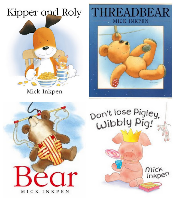
Breaking down my research from numerous different illustrators and their designs into a more select variety, I have decided to focus in on the illustrators; Mick Inkpen, E.H. Shepard, Alison Edgson and Susanna Gretz.


Mick Inkpen
1. The Kipper Collection (Kipper and Roly)
2. Threadbear
3. Bear
4. Wibbly Pig
Here I've chosen Mick Inkpen, being one of my favourite illustrators, I'm drawn to his simplistic style, with a mottled watercolour style colouring. Each book (apart from the Kipper Collection) have varying typefaces which speak for the book, with a unique use of texture and colour. Not only are these books illustrated in an attractive and fun way, but the stories are just as special. I was first introduced to Mick Inkpen's illustrations when I was a child, more so through the book 'Threadbear' than any other. This quickly turned into one of my favourite books, not only because of its adventure storyline, but also because of it's memorable illustrations.


Links:

Mick Inkpen Talks About his works (A great interview with Mick Inkpen)


E.H. Shepard
1. & 2. Winnie the Pooh
3. & 4. Wind in the Willows
E.H. Shepard's designs work with watercolours and pens to create the human-like creatures of classic children's stories such as Winnie the Pooh and Wind in the Willows. E.H. Shepard, unlike modern illustrators such as Mick Inkpen (who illustrates more contemporary designs), created more vintage-style designs, which fit in precisely with the era in which he was at work. These illustrations (along with the hand-rendered typeface) work in perfect harmony with the classic stories.

Links:

E.H Shepard's Wikipedia Page
The E.H Shepard Archive


Susanna Gretz
(below are scans from my book)

Cover:


Stories within the book/back cover:

Double-Page Spreads:

Title Page for Frog, Duck and Rabbit - simplistic, clear and the typeface is legible


Rabbit is boasting - simple black legible typeface, characterisations match perfectly with the feel of the story (facial expressions)


Rabbit boasts further over chocolate sandwiches - the creatures have similar attributes to human behaviour (relatable), makes the reader feel part of the table. Simplistic, minimal typeface use. Also use of speech bubble unique and offers exciting alternative to most books for children (especially those learning how to read)


Singular Individual Pages:


 Rabbit and Duck make a cake - a wide variety of colour, this page stands alone rather than also relying on the other side of the double page spread, which is unusual for this book


Rabbit and Duck surprise Frog on her birthday - although this is part two of a double-page spread, this illustration is also capable of standing alone. Use of colours is wider than on most pages, and the handmade card by Duck and Rabbit stands out due to it's bright colouring and roughly hand-written typeface - a refreshing change from black clear type


The friends celebrate Frog's birthday - Further use of speech bubbles and busy/colourful illustration makes the reader feel a part of the excitement. Attention to detail also brings this illustration out above others in the book further


Duck is bossy - a stand alone page, this illustration stands out as each character is doing their own thing, more use of speech bubbles, and the texture of Rabbit's fur is exciting and his expression makes it humourous


Duck and Frog call Rabbit names - Exciting use of large, Sans Serif typeface, as opposed to the usual Serif typeface (as show below Rabbit) one singular image so attention is drawn to both this and the large typeface


Final Pages:


The friends make light of calling each other names and know understand it's wrong to call names - Final image shows closeness between characters, symbolising that they're all friends once again


Duck stops being so bossy - Short, simple finishing sentence, further use of speech bubbles and clear, distinguished imagery. 

Here Come Frog, Duck and Rabbit is one of my favourite childhood books, so I've decided to scan in some stand-out pages that I remember specifically or those which elevate themselves artistically from an illustrator's point of view. Susanna Gretz is one of the first illustrators to use detailed characters and forefront illustrations above a clean white background. Illustrators such as Mick Inkpen have certainly taken over this recognisable style and carried it throughout a variety of children's books. These illustrations work in perfect harmony with the story lines of the four short stories within the book and are closer detailed and coloured enough to be captivating, but simplistic and sparse enough not to draw attention away from the story itself.


Alison Edgson
1. Me and My Dad
2. Me and My Mum
3. When Will It Snow?
4. On a Starry Night
Although I remember coming across a book when I was younger that I believe to have been illustrated by Alison Edgson, I haven't been familar with her work. However on further research, I've become exceedingly fond of her illustration style,

I've chosen Alison Edgson as my focused Illustrator (alongside Susanna Gretz), as I love her cute, individual illustrations, and because I feel her graduating use of colour for backgrounds placed behind characters is charming, and her characterisation brings a lightness and warmth the story. Her art style appears to center around a combination of the use of hand-rendered paintings and computer software, which gives the finished piece a softer look, rather than a rougher approach (for example use of pen).


Alison Edgson's Published work to date:

(among stand-alone illustrations)

• Mathemagic (2007)

• Me and my Dad! (January 2007)

• Three Billy Goats Gruff (June 2007)

•The Emperor's New Clothes (October 2007)

• The Elves and the Shoemaker (October 2007)

• Silly Goose (May 2008)

• Lost in the Snow (August 2008)

• My Little Night Light (August 2008)

• Follow that Bear if you Dare (August 2008)

• Me and my Mum (January 2009)

• By Lantern Light (August 2009)

• The Magical Snowman (October 2009)

• Winter Magic: A Spellbinding Collection of Christmas Animal Tales (October 2009)

• A Winter's Night (October 2010)

• Yuck! That's not a Monster! (November 2010)

• The Magician's Apprentice (March 2011)

• The Little Bunny and Other Animal Tales (March 2011)

• A Little Fairy Magic (June 2011)

• Star Friends (July 2011)

• When Will It Snow? (October 2011)

• Winter Wishes (Animal Anthologies) (October 2011)

• Just One More! (February 2012)

• Bear and Turtle and the Great Lake Race (February 2012)

• Love You Baby: A Beautiful Baby Record Book (July 2012)

• Puppy's First Christmas (September 2012)

• Au Lit, Petit Ours! (September 2012)

• On a Starry Night (October 2012)

• I Want my Mummy! (January 2013)

• Make a Wish! (Due release 2013)


I believe all of the books Alison Edgson has chosen to illustrate for are aimed for the age range between 1-10 years old. These books are perfect 'bed time stories' for young children, as there are no intrusive, strong colours, and the illustrations are subtle. The stories themselves are slow (which makes them suitable for 'bedtime' and also for young readers) and the typefaces are clear and unique in the way that they have a warm, hand-written feel to the titles and important, highlighted parts of the story. I feel that all elements of the book (story, typeface and pictorials) are working in harmony with each other, making the illustrations successful, as (alike 'Here Come Frog, Duck and Rabbit') the illustrations and typeface don't take away from the story, more they work together to bring the story to life.

To summarise, I have found that research into many different illustrators that stand out to me to be has been of great use. I now feel I have further knowledge in relation to both image and text working in harmony with the storyline of an illustrated book, what it is that makes a successful illustration in children's book design.